My83 Insurance
Date | Apr. 2017
UI/UX Design | Sheng Pan
Client | My83
Tools | Sketch
MY83 bundle product of newborn offers you suggestion insurance packages for newborn babies.
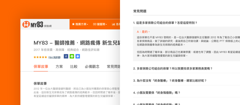
However, the information is too messy to read and users got lost after reading bunches of information. When they decide to buy one of those packages, they can't find the button for reaching insurance managers. Information without structure and vague call-to-action button cause lower conversion.
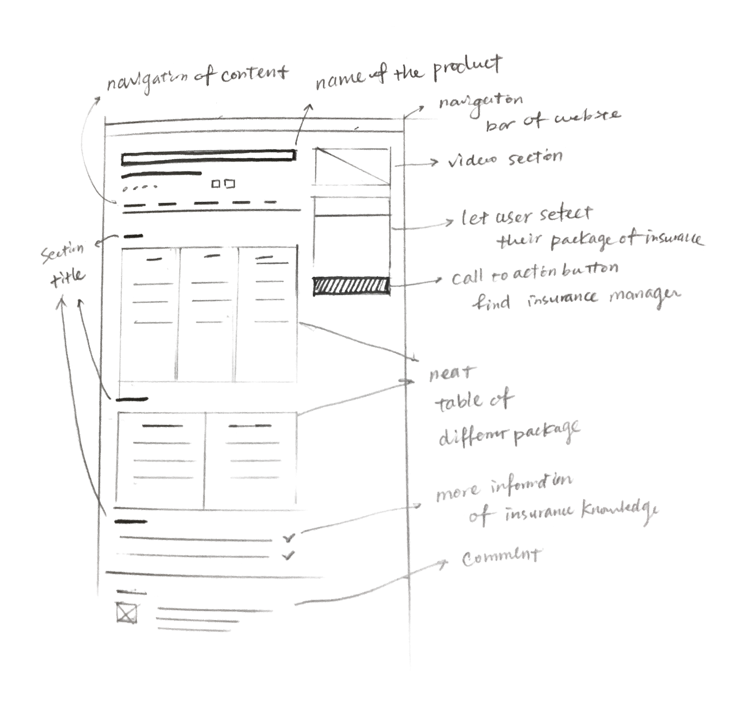
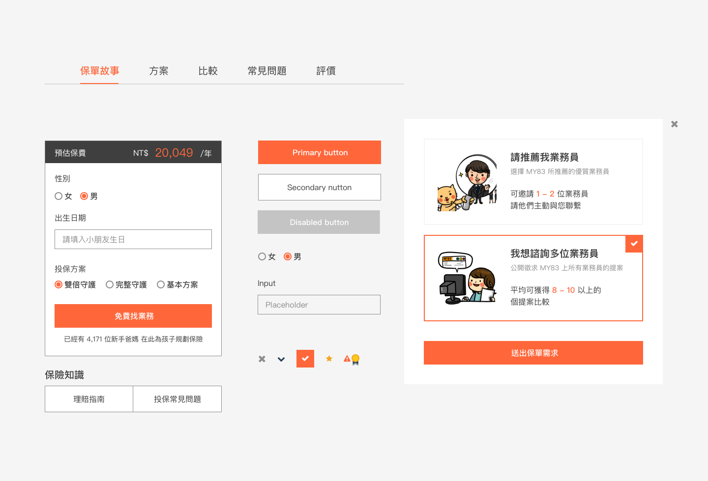
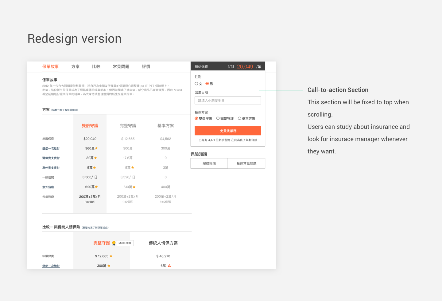
I put the call-to-action section on the right side, setting it's position to fixed so that users can reach the insurance manager whenever they want.
The call-to-action section shows price of different package and alow users to fill some basic information for insurance.
The orange action button follows the original MY83 guide. I highlight all action word and button with orange.
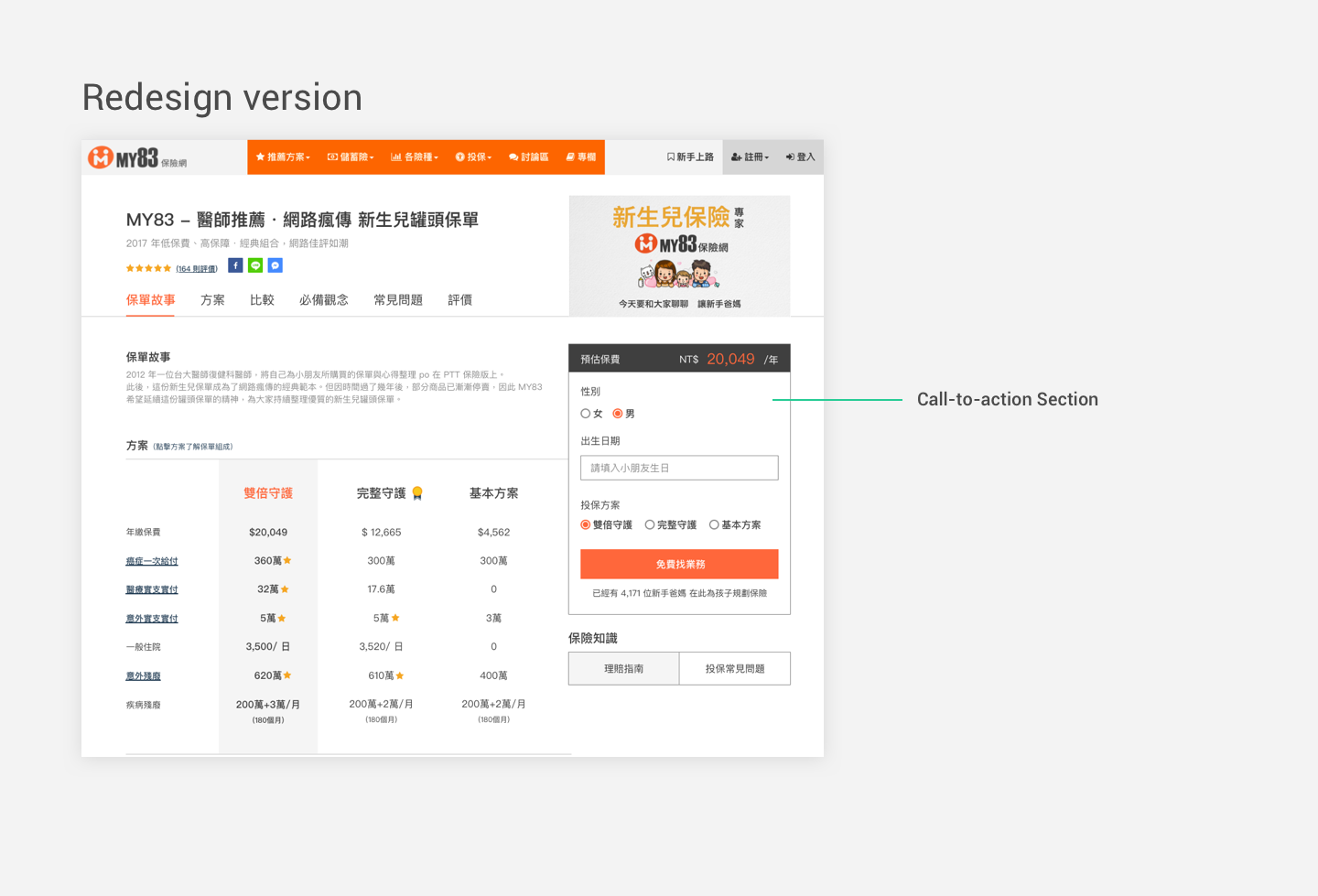
Due to plentiful information tha causes the content long, I create a navigation for content. The page is separated into six parts, six sections. Users can click the navigation and jump to the section they want to read instantly. Navigation reduce the chance users get lost during scanning for information they need.
I create some components and follow the main color scheme of MY83 website. The template of this product page will be applied to other product pages. It would reduce the cost of developing another new UI for My83 team.